I feel so grateful to have the Connected Marketing team to serve you and my other clients with. Becuase they are smart, funny and big hearted. And I just love being able to serve more people with a wider scope of skills.
Today I’m sharing a blog from Jess who was an intern last year that I managed to convince to stay with me. For the last year and a bit, Jess has been helping me deliver done for you services. This year she has been doing some post-grad study and we are very lucky becuase she just learned all about Digital Publishing! No more Canva for eBooks over here. We are excited and ready to deliver eBook creation for you and here are Jess’s top tips to get you ready for your eBook.
Over to Jess:
Here are 4 tips I’d love to share with you from what I learned in “Digital Publishing” for designing your next eBook:
- InDesign and why it’s easier than Canva,
- Why you should use a grid,
- two lay-outs and when to use them and
- a little about how typography can make reading easier on the eyes.
Tip 1 – InDesign
Abode InDesign. Some people love it, some people hate it. For me, I love it. Not the price, but the ease of doing everything compared to using Canva. I’ve made eBooks in both Canva and InDesign.
When it comes to usability and efficiency, hands down, my choice is InDesign.
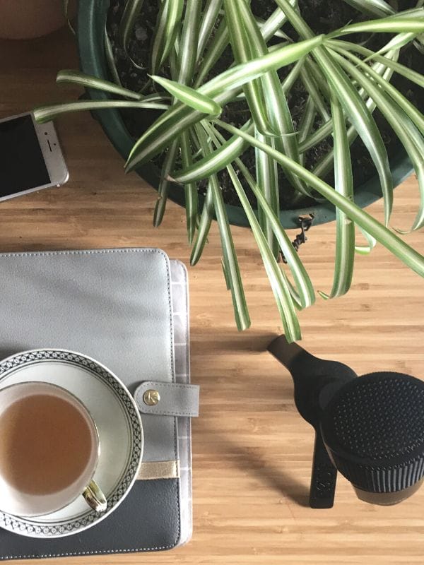
Once you’ve learned how to use it, you’d be amazed by the things you can in there. Don’t get me wrong Canva is great for creating quick and easy social media posts and graphics. But for making an eBook, Canva had me pulling my hair out. Whereas InDesign had me sipping cups of tea and listening to music while effortlessly creating an eMasterpiece.
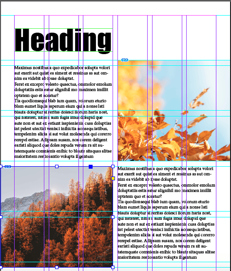
InDesign allows you to pre-format the entire document so all the pages have the exact same margins, gutters and grid. And if you change your mind on these setting half way through, changing the entire document is only a click away.
You can also format the heading and body text with a particular font and size so you don’t have to keep changing this throughout the document. You can save these preferences in a section in the tool bar and are able to select parts of the text and apply the formatting.
If you wanted to up the ante and add buttons instead of scrolling through the eBook, no problem. You’re able to create buttons and page numbers that will automatically populate on each page.
Be gone the headache of having to individually add these elements to a document in Canva.
There is also a pretty handy function called layers. This function allows you to place images, text, or what-ever else you want to keep grouped and separated on a particular layer. What I really love about this is that you can turn the visibility of the layers on and off whilst playing around with your placement. Also, Indesign has the capabilities to create EPUB’s which can then be publish in iBooks. This is just the tip of the iceberg.
Tip 2 – Use a Grid
Why bother using a grid you ask?
You’re not alone here, I thought the exact same thing until I started incorporating a grid in my projects.
A grid brings consistency and order to a design.
It gives a solid foundation to build upon rather than staring at a blank page and trying to figure out what will go where. If you’ve ever spent hours aimlessly move things around the page to no avail. Then a grid help can help you to easily align objects and text to make a better user experience.
How?
It allows the reader to identify hierarchy and digest information more easily.
The more columns and rows you use in your grid the greater the flexibility you have in your design. Pair a grid with and ‘F’ or ‘Z’ layout, and you’re winning, the eyes of your reader.
Tip 3 – How to lay out your page
A couple of teeny tiny things to keep in mind when arranging the content on your page when trying to make the most out of precious real estate.
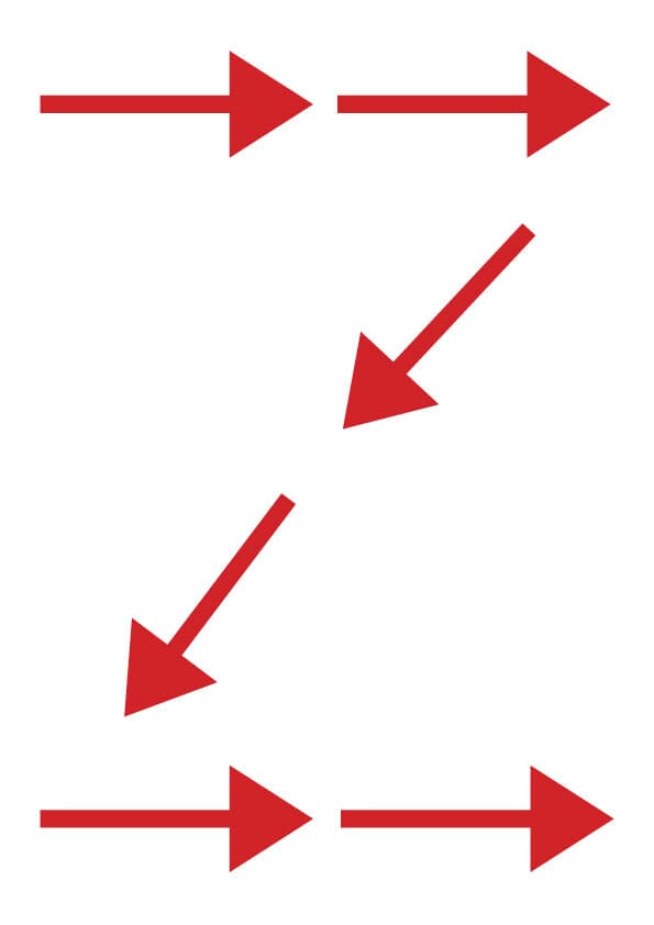
‘Z’ layout works well for pages that have minimal content.
You can use this arrangement to draw the readers eye across the top of the page and diagonally across then down to a CTA (call to action).
‘F’ layout is good for text-heavy pages.
The eye naturally starts at the top of a page and scans across and down, mainly focusing on the left-hand side until something interesting catches the eye.
Tip 4 – Don’t let Typography steal the show
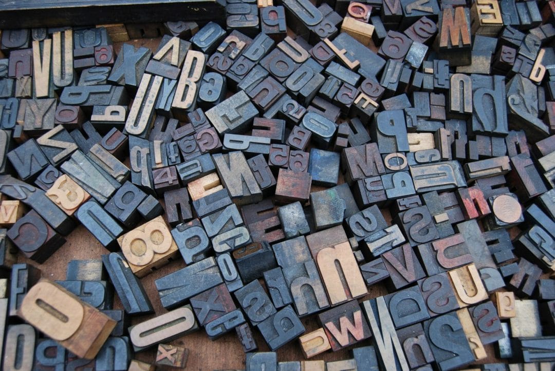
Fonts should deliver a message without sealing the show, they should almost go unnoticed.
So if you have fallen in love with a swirly, intricate font, use it sparingly because you don’t want to make the reader have to work too hard to understand your message.
Otherwise, they might just give up.
San serif (no tail) fonts are good for screen-based and small text because it’s easier for our brains to identify the simple form of the letters. Serif fonts (with tails) are good for print because the serifs guide the eyes along the page. If you wanted to use serif fonts for screen-based text use a bigger size, like for a heading.
Massive thanks to Jess for writing this blog.
Got questions?
Pop them in the comments or book a free chat to discuss your project.

Need Help With Your eBook?
Now you have some key design tips to use in your next eBook. Or just get us to do it for you, we’d love to help you create something beautiful to share with the world.
Book a free chat to discuss your project.
Want more help with your online business presence?
Do you need a hand with all the different ways your business can show up online? Video, Facebook, website, Instagram, Facebook ads, email marketing. The list can be overwhelming.
Book a complimentary chat with me and let's see if I can help:

